
This year marks the 40th anniversary of York Health Economics Consortium (YHEC). To celebrate four decades of partnership and progress, we are launching a special series of blogs that explore the past, present, and future of our field. There is no better place to start this journey than at the very beginning. Before we delve into the nuances of policy or the intricacies of economic modelling, we want to peel back the layers and address a fundamental question that is often misunderstood: What, exactly, is health economics? In this blog, our CEO, Professor Matthew Taylor, breaks this down in simple terms.
Many people equate ‘health economics’ with ‘health economic evaluation’ (i.e. measuring and estimating the cost effectiveness of specific health interventions). However, health economics as a discipline is far broader than that. Perhaps a good starting point is the famous ‘plumbing diagram’ developed by Alan Williams in 1987 (one year after YHEC was established in Alan’s adopted city of York, UK). I was fortunate enough to have been taught by Alan, and his ideas and influences are as relevant as ever.
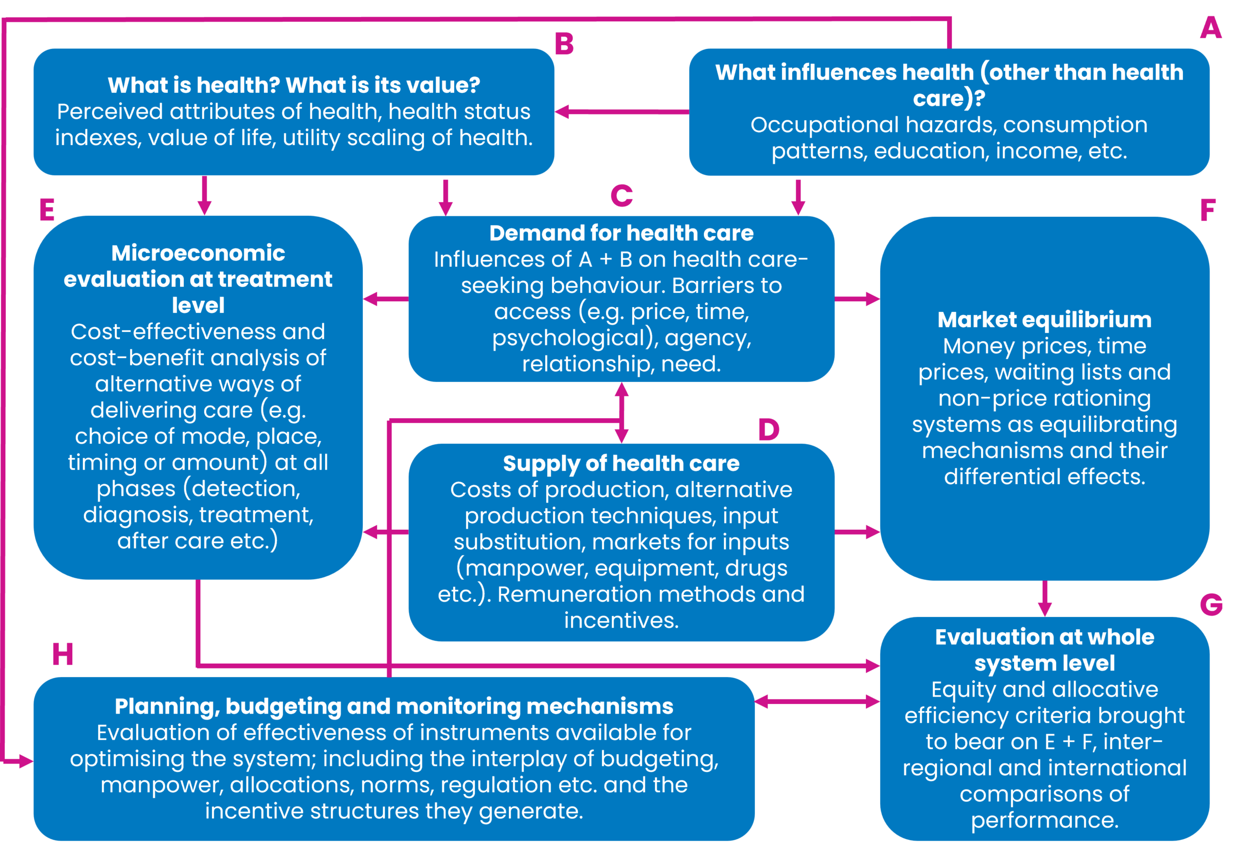
The eight subdisciplines of health economics, as he defined them, are:
- What influences health?
- What is health and what is its value?
- The demand for healthcare.
- The supply of healthcare.
- Micro-economic evaluation at treatment level.
- Market equilibrium.
- Evaluation at whole system level.
- Planning, budgeting and monitoring mechanisms.
As Williams points out, there is substantial interaction between each of these disciplines. For example, I would argue that it’s impossible to truly understand ‘E’ (economic evaluation at treatment level) without having a good grasp of ‘C’ and ‘D’ (demand and supply of healthcare). Likewise, none of the other disciplines will make sense if we can’t define ‘B’ (what is health?).
As an exercise, let’s try to define ‘health’. A commonly cited definition is the World Health Organization’s description of health as “a state of complete physical, mental and social well-being, and not merely the absence of disease or infirmity.” Health economists often find this appealing conceptually but problematic operationally. If health is multidimensional, subjective, and influenced by social context, then measuring it (and valuing changes in it) becomes inherently complex. This is precisely why health economics devotes so much attention to concepts such as quality-adjusted life years (QALYs), disability-adjusted life years (DALYs), and broader notions of wellbeing. These constructs sit squarely within ‘B’ (what is health, and what is its value?).
Once we accept that health is shaped by far more than medical care alone, we are led naturally to ‘A’ (what influences health?). Income, education, housing, employment, environmental conditions, and individual behaviours such as smoking or diet often matter more for population health than any single clinical intervention. Smoking cessation is a good illustration. Decisions about tobacco taxation, advertising bans, or funding for stop-smoking services are not primarily about hospitals or medicines, yet they can deliver immense health gains at relatively low cost. These upstream choices then feed downstream into the healthcare system by altering future demand for services such as oncology, respiratory care and cardiology.
This brings us to ‘C’ and ‘D’ (the demand for and supply of healthcare). Demand is not simply about patients “wanting” care. It is shaped by need, preferences, prices (including non-financial ‘costs’ such as waiting times), and information asymmetries between patients and clinicians. Supply, on the other hand, depends on workforce constraints, capital investment, technology, and organisational incentives. Oncology care targets, such as maximum waiting times for cancer diagnosis or treatment, sit at the intersection of demand and supply. Setting an ambitious target may reflect societal values about the importance of cancer outcomes (‘B’), but whether that target is achievable depends on workforce availability, diagnostic capacity, and funding (‘D’). Failure to align these elements can result in unmet demand, queues, or displacement of care elsewhere in the system.
The COVID-19 pandemic provides a particularly vivid illustration of the entire plumbing diagram in action. Early decisions about lockdowns were fundamentally about ‘A’ and ‘B’. How social interactions influence health, and how society values reductions in mortality and morbidity relative to restrictions on liberty, education, and economic activity. Facemask recommendations similarly involved judgements about individual behaviour, externalities, and collective responsibility. Vaccine approval and rollout decisions brought ‘E’ into sharp focus: rapid economic evaluations of vaccines assessed costs, health benefits, and uncertainty under extreme time pressure. Yet these treatment-level analyses could not be interpreted in isolation. They interacted with supply constraints (‘D’), public willingness to be vaccinated (‘C’), and system-level considerations such as hospital capacity (‘G’).
Market equilibrium (‘F’), is often implicit rather than explicit in public debate, but it remains central. Market failure is a high risk in healthcare systems. Prices are regulated, information is imperfect, and rationing frequently occurs through non-price mechanisms. During the pandemic, shortages of personal protective equipment or intensive care beds highlighted how fragile the equilibrium can be when supply cannot adjust quickly to surges in demand. More generally, international league tables comparing health spending, life expectancy, or avoidable mortality reflect how different systems reach different equilibria based on political choices, institutional design, and societal preferences.
Evaluation at the whole-system level (‘G’) asks whether the healthcare system, taken as a whole, is delivering value relative to the resources it consumes. National life expectancy targets, for example, are not attributable to any single intervention. They reflect decades of accumulated decisions across public health, healthcare delivery, and social policy. Comparing performance across countries inevitably brings politics into view: how much should be spent on health as a proportion of GDP, how progressive should funding be, and how much inequality in outcomes should be tolerated?
Finally, planning, budgeting, and monitoring (‘H’) is where health economics most visibly meets day-to-day policy. Decisions about annual health budgets, multi-year spending reviews, or performance frameworks translate abstract values into concrete constraints. Economic evaluation informs these processes, but it does not determine them. Political priorities, fiscal rules, and public accountability all shape how evidence is used.
Taken as a whole, Williams’ plumbing diagram is a reminder that health economics is not just about cost-effectiveness ratios or modelling exercises. It is about understanding how values, behaviours, institutions, and constraints interact to shape health outcomes. Whether we are debating pandemic responses, smoking policy, cancer targets, or international comparisons, health economics provides a structured way of thinking about difficult trade-offs. More than anything else, it tells us why seemingly simple questions in health policy are rarely simple at all.
For forty years, York Health Economics Consortium has worked at the interface between evidence, policy, and practice, applying health economics across the full breadth of Williams’ plumbing diagram. We help governments, health systems, and life sciences organisations navigate complex trade-offs under uncertainty. In doing so, we aim not just to answer technical questions, but to support better, more transparent decisions about how limited resources can be used to improve health and wellbeing for everyone.
Contact us
Contact the YHEC team to find out more about how we can support your health economics needs. If you want to learn more about health economics, our resource hub and glossary offer useful definitions and explanations of common concepts.